Dormify Ecommerce Site ReDesign
When we migrated our site from Magento to Shopify, we were on a 4-month timeframe. Introducing ideas around a site redesign posed a serious hurdle to us launching the site on time. As a result, we made the decision to keep the same fundamental site design after the migration and the revisit the site's design after our peak season. The other great side effect of this approach was the ability to truly parse out the results of:
Conversion Rate lift of the same site on Magento vs. Shopify
Conversion Rate lift of a brand new design on Shopify vs. the old design on Shopify
As a tester and optimizer, this was pretty much the best outcome I could have asked for. Compared to our old design, this design has resulted in 41% lift in overall conversion rate and an 85% lift in transactions on mobile.
Starting Points
Every year after our season peaks, we do a deep dive into user research of all varieties: qualitative, quantitative, interviews, and more! Overall, a few key themes emerged:
Teens are the planners
If mobile is king, then Instagram is queen
Their frame of reference for online shopping is fast fashion, not home decor
Core Site Strategy
From our research, we developed a few guiding principles by which to design the site:
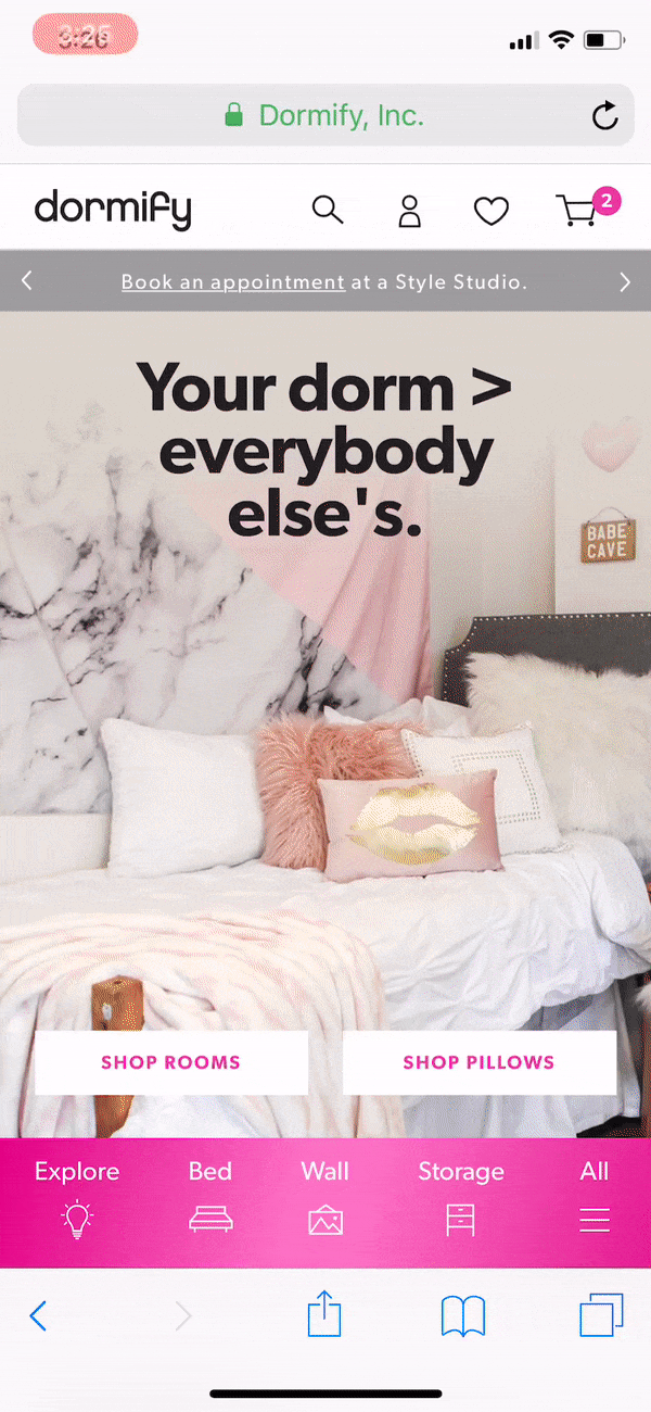
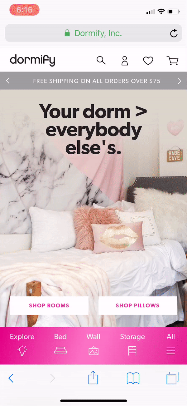
Mobile-first. Seems obvious, I know, but it cannot be stated or emphasized enough, especially with a young audience. At desk jobs, we realized we are on desktop way too much and don't devote enough time to what your UX experience is like on-the-go and we wanted to change that.
Simplify. Again, sounds obvious, but it's critically important to culling the unnecessary to deliver a high-converting experience
Highly visual. Our shopper and our brand is highly visual. Photography brings our product to life and our shoppers shop by the photo.
Mobile First
From our research, we learned that it's the incoming freshman, not the parents, that drive the decisions in decorating a dorm. Where do most of these incoming freshman spend their time? Instagram. Our bottom nav bar mimics the feel of Instagram while the quick links and quick add help mobile users accomplish key actions faster.
App like mobile navigation
Quick links on mobile
Quick add on Category page
Mobile Navigation. Over time our navigation had gotten bloated and started to recall images of an over-stuffed junk drawer. Our shopper's main paradigm for online shopping was fast fashion, not home decor, so we decided to drop the jargon and make it simple. With a mobile-native generation, we wanted our navigation to feel app-like and inviting unlike a hamburger menu that can be overwhelming and
Mobile Quick Links. Mobile navigation doesn't strictly have to live in a hamburger or on a button. We wanted to present a few popular categories on homepage load with a simple treatment so that users could access them without having to open the navigation.
Mobile Quick Add. With products that come in multiple size variants and colors, we wanted to create a lightweight way for users browsing categories to add items that they liked without having to change pages. On mobile, we launched a small modal to confirm selection then pop out the cart drawer as confirmation of the item the user just added.
Simplify
Fewer Categories and heavier reliance on subcategories for filtering
Digestible Product Specs

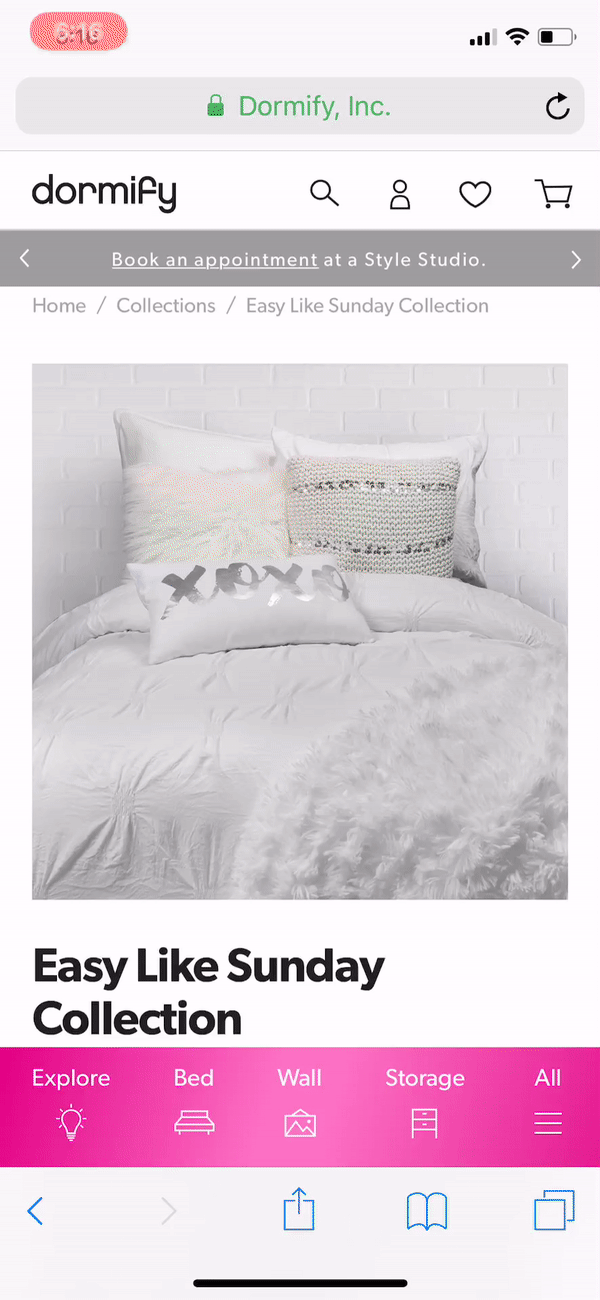
Filtering Subcategories. We learned in our user research that in some cases, they are looking for a very specific product type and in others they aren't necessarily looking for one exact thing on our site. We wanted to help them achieve both ends with a new system of broader categories that could leave room for inspiration by browsing and the addition of filtering by granular subcategories.

Product Page Layout before Redesign. This was a minimalist layout. The inforamtion was there but the accordions were a barrier to accessing all of that information on mobile quickly with minimal taps.
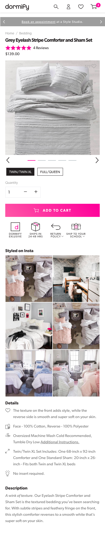
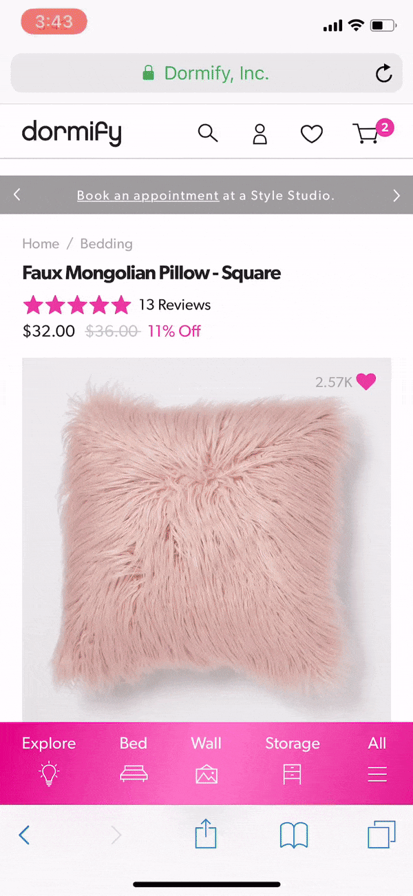
Product Page Layout after Redesign. We leveraged 2 systems of icons in the redesign to highlight important features about each product. The first set at the top is mainly about logistics. The second set provides specific details about the product (dimensions will change with size variant selection!).
Highly Visual
Our users come to us for inspiration and that was a core value we wanted to build into our UX/UI of the redesigned site. From simple interactions like ensuring a user could see the alt images change on a product page when she changed color swatches to using iconography to signal the navigation category.
Customizable Collections Filters
Alt Image Galleries on the Product page (and Category Page)
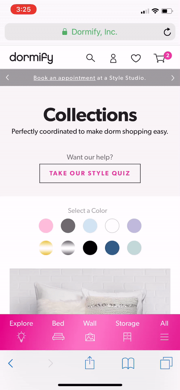
Customizable Collections Filters. This year, we had about 90 looks that shoppers could choose from, up from our 60 last year. They are all highly visual so we didn't want to scale down the image size. Instead, we reused an existing property encoded to the look (primary and secondary colors) to create a filtering system that you could use to browse the selection quickly by a certain color scheme.
Alt Image Galleries In our research, we learned two things: our users need to see it in a space and they will buy what they see. As a result, our creative team doubled down on variant image photography to make sure that we had a deeper library to showcase. On the site, we created variant image galleries where the entire gallery swaps out when you change color variants.