HELP CENTER REDESIGN
Our Customer Support team works through about 100,000 tickets each year. We pride ourselves on having a thorough knowledge base that provides the answer to just about any question that our customers ask.
However, merely having the content doesn't guarantee that a customer with a question will actively search through our articles. Moreover, a large amount of our traffic comes from mobile. These two considerations were formative in our redesign of the help center.
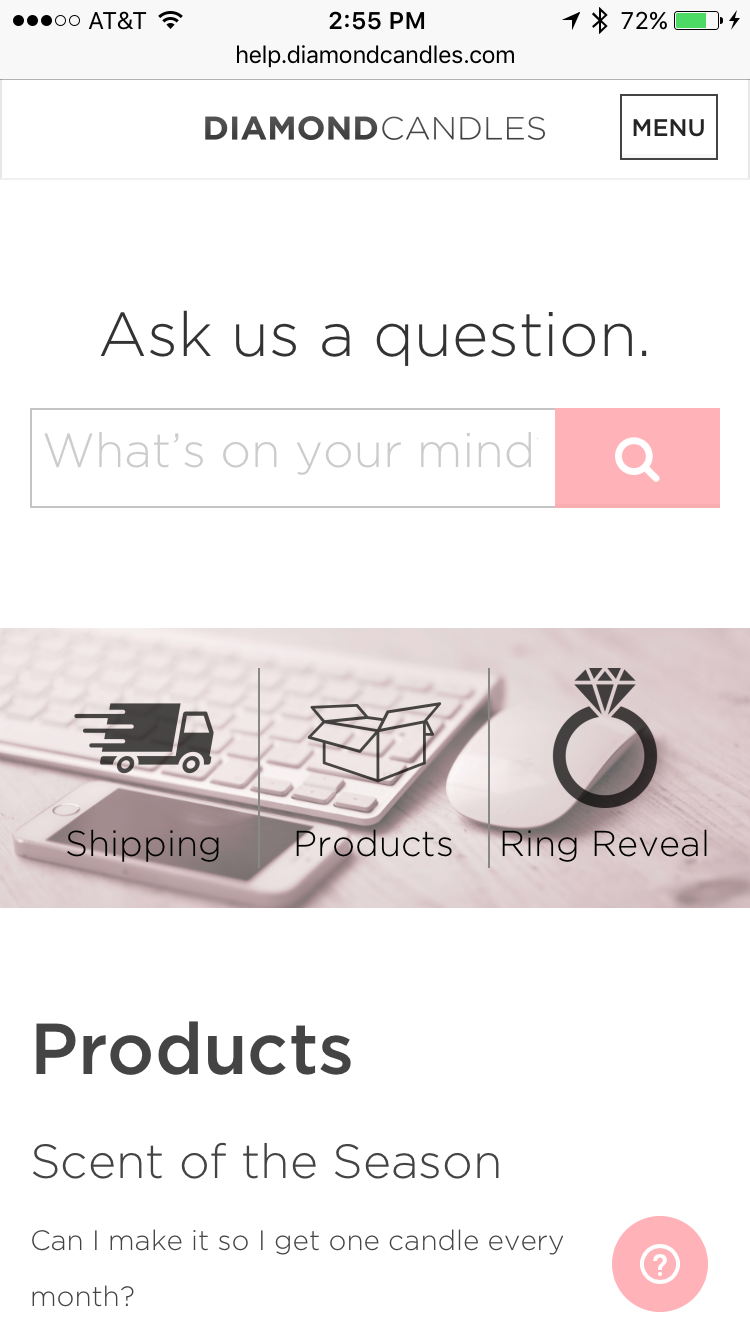
Search, Front and Center
We gave the search prominence on the page. Rather than navigate through article lists, we direct the customer to type their question into the bar, providing the fastest answer to their question. Instead of using Zendesk's native search functionality, I integrated Algolia search on the Zendesk platform to increase search performance in speed and relevance ultimately resulting in a better site experience.
Simple, Friendly Interface
With a large amount of content, we wanted to ensure that the design felt friendly, yet sophisticated. We used a dark grey for primary text and icons instead of black to soften the text.
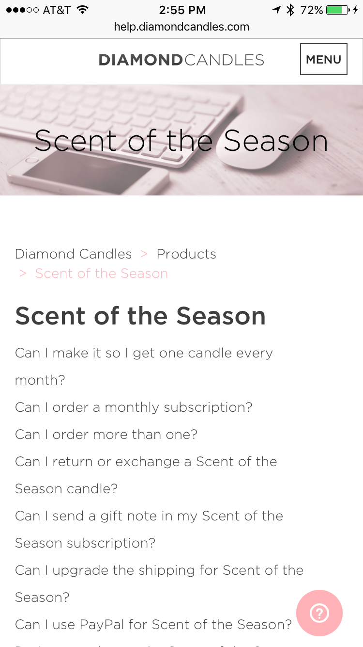
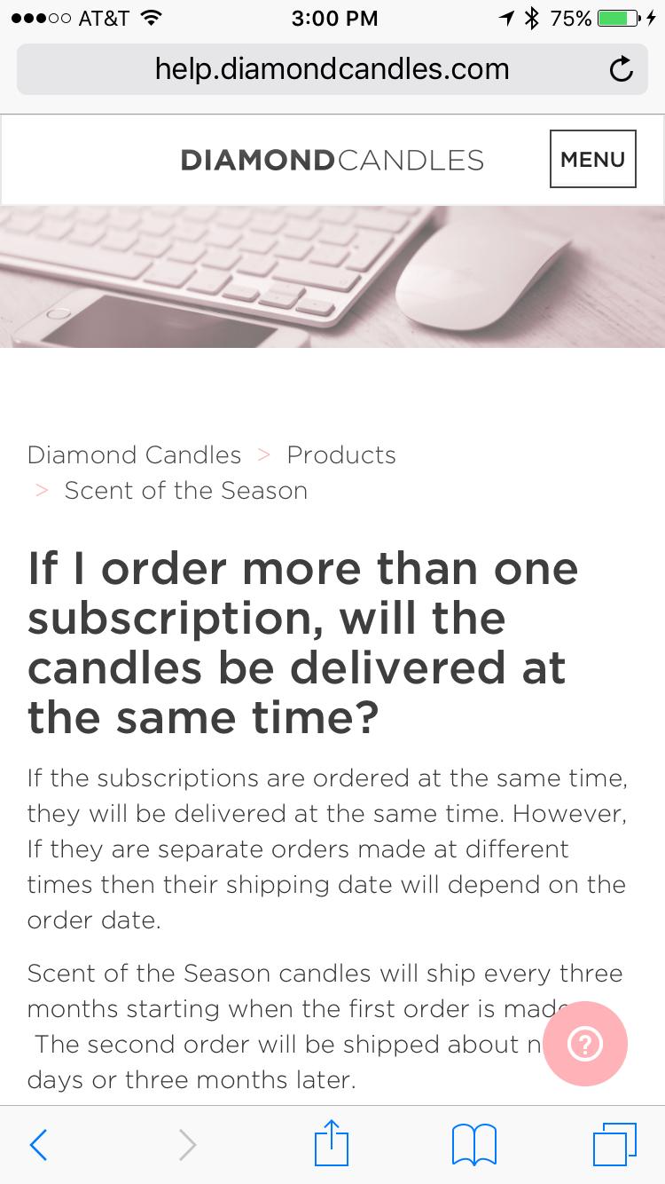
Readability
We implemented a two-column layout to ensure that the content can be easily scanned by a customer. Text that runs wider than 600px tends to look onerous and can add friction to the experience.

Help Center Home on Desktop
Mobile
In our mobile design, search maintains prominence, hovering around the center of the screen, within thumb's reach. If a customer wants to access a specific category, she can tap on the icon of the category under the search bar.
We decided to place the menu button on the right hand to be easily accessed by the thumb.
Web Widget
In both designs is a small help bubble in the lower right hand corner. It is a nice lightweight option to something like live chat that can answer a customer's questions quickly without them ever having to leave the site. I implemented it on both the help center and on our main site.
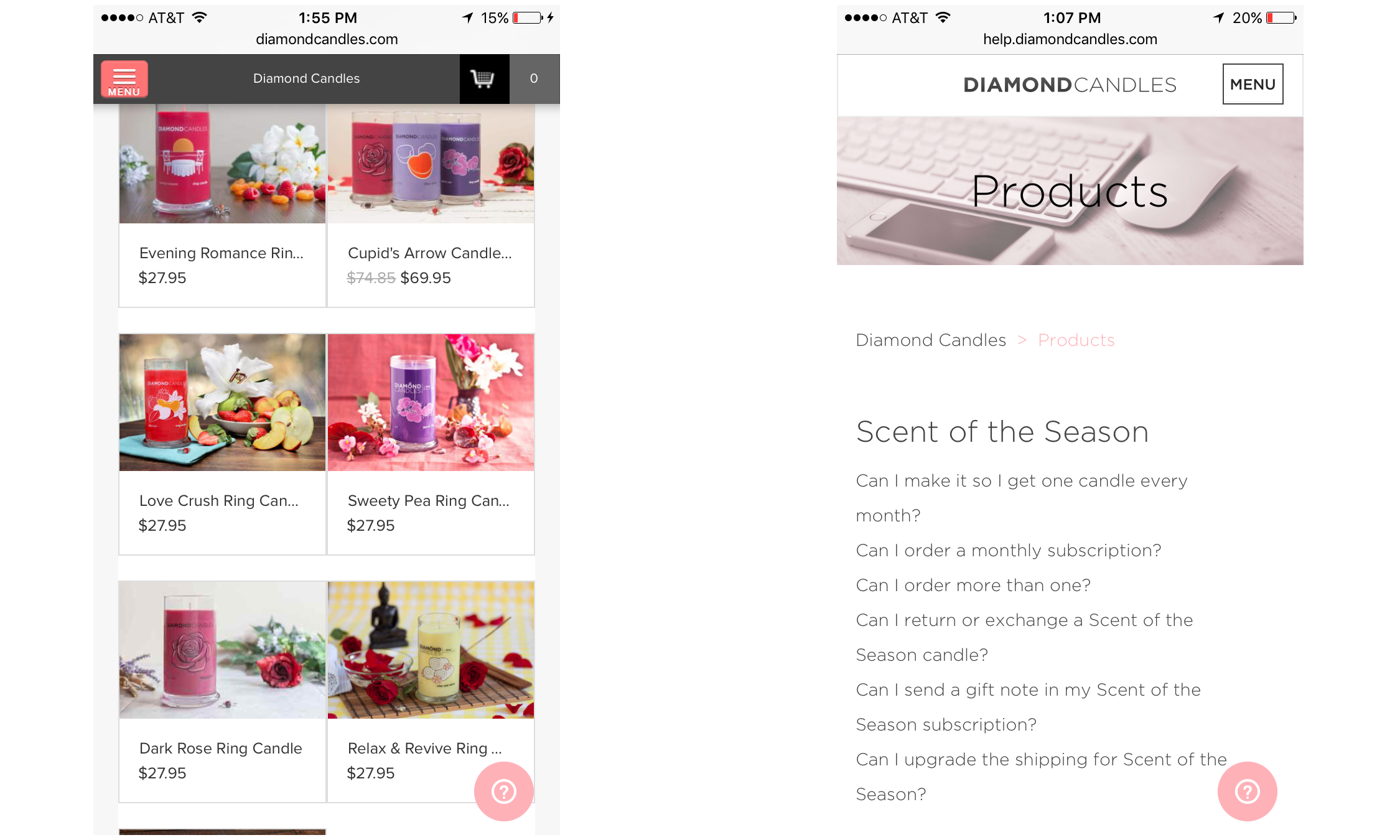
Web Widget on Main site (left) and Help Center (right)
Prior to launching the web widget, we had about 17% of search queries result in the customer creating a ticket. These search queries only occurred on the Help Center since there was no help search on our main site.
The web widget is easily accessible by tap on mobile on our main site and help center, making our deep knowledge base accessible in a more convenient format for the customer. Since launching the widget, our search volume has increased by an incremental 200%.
As a result, customers have been able to get their questions answered instantly without generating additional tickets for our customer service team. Even though the number of search queries has risen 200%, there has been a 58% decrease in the number of queries that result in a ticket. With the search string data, our customer service team is able to create new FAQs based on search queries that don't return results and determine which topics customers search frequently. We have already used the learnings from the web widget to inform the navigation for our main site.